In this tutorial we are going to see how to create a custom dashboard using external web-services like REST APIs inside Google Sheets without writing a single line of code.
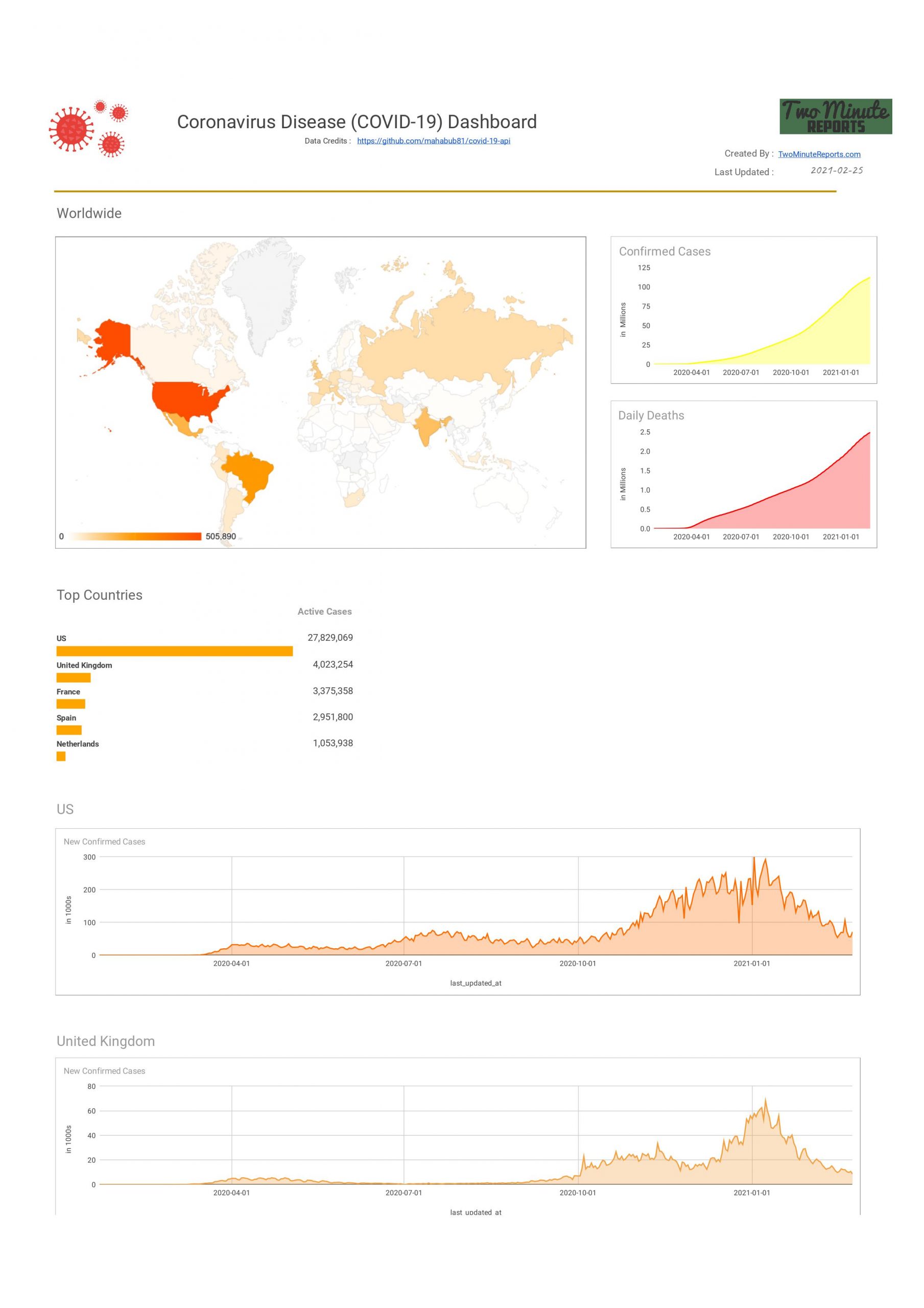
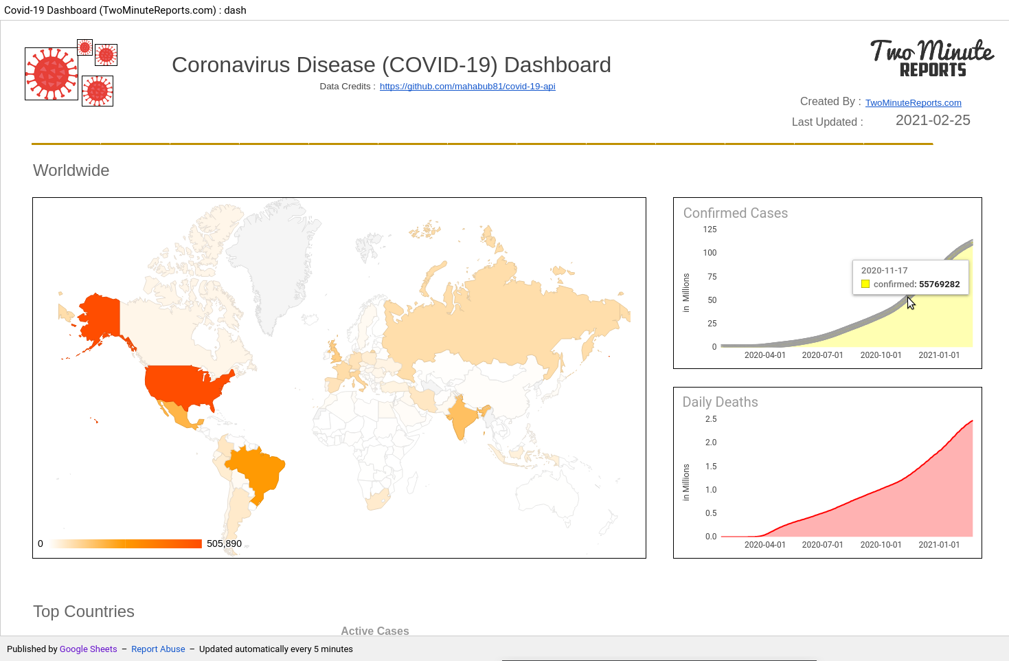
We will create a Covid-19 live tracker dashboard like below that automatically updates periodically and fetches data of the Countries with most Active Cases automatically.
You can checkout the full spreadsheet with formatting here. We also show you how you can publish it as an interactive webpage like this.
In this tutorial you will learn
- How to get data from REST APIs in Google Sheets
- How to format, sort the incoming API data
- How to make dynamic API requests with formulas
- How to update data periodically
- How to publish as an interactive webpage
First, let’s identify the API source to feed the data for our dashboard. After a lot of research I found this free (https://github.com/mahabub81/covid-19-api) API with enough data endpoints for our dashboard.
Connect Google Sheets with the Coronavirus API
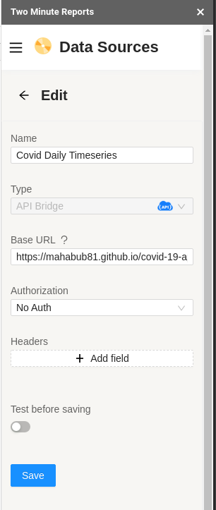
First, we need to install Two Minute Reports in Google Sheets, launch the sidebar panel and add the new API as a data source in Google Sheets.
Select API Bridge as the Data Source type, which is the JSON API connector of Two Minute Reports, and enter https://mahabub81.github.io/covid-19-api/api/v1 in the Base URL section, we can find the Base URL from the API documentation.
Since our API documentation prefixes https://mahabub81.github.io/covid-19-api/api/v1 in all its endpoints, we add it as the base URL.
There is no authentication required for using the API, so we skip other options and proceed to save.
Let’s explore the API and get some RAW data to play with, in Google Sheets. There are so many endpoints to choose from, from the Covid-19 API.
In our dashboard we want to have multiple charts, lets go through them
| CHART | DATA REQUIRED | API ENDPOINT |
| Worldwide Cases Confirmed, Deaths (2 charts) | World summary time series | /world-summary-time-series.json |
| Global Countries Map highlighting Daily Deaths (1 chart) | Countries and their latest update | /countries.json |
| Worldwide Top Countries Table (5 sparklines) | Countries and their latest update | /countries.json |
| Top 5 Country wise , New confirmed cases (5 charts) | Time series for all countries, separate endpoint for each country by country ISO code | /countries/ISO.json , ISO should be replaced with the two letter ISO code of the country. Eg. for US the endpoint will be /countries/US.json |
Get data from a REST API in Google Sheets
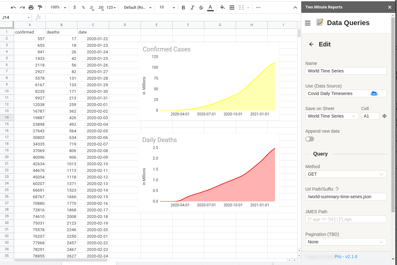
Lets get the data of World summary time series, by creating a New Query from Data Queries Section.
I enter just “/world-summary-time-series.json” in the URL Suffix as we know the rest of the URL (“https://mahabub81.github.io/covid-19-api/api/v1”) was already specified as the Base URL when adding the data source. I skip other advanced options and press Run Query, to see the data. The data comes pre-formatted nicely as in the below screenshot. Sometimes, when the data from the API is not so clean, we might need to tell API bridge to format it, we will see how in the next section. We can easily create the charts using by selecting the data and going to Insert -> Chart. We format the chart as per liking and create the two charts necessary for our dashboard.
There are multiple options to choose from in the Data Queries section of API Bridge, to learn about each of them in more detail, check our API Bridge knowledge base.
Using JMES Path to Format & Sort the incoming API data
To add the next Global Countries Map chart we need the “Countries and their latest update data” from the /countries.json endpoint
I create a new sheet named “World Summary” to hold the new data and enter “/countries.json” as the URL Suffix and press RUN Query
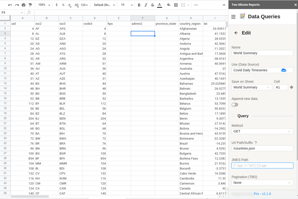
This returns too much information that we don’t need. We only need iso2, country_region, latest.active, latest.confirmed, latest.deaths and latest.last_updated_at from the API. We also need the data to be sorted by the most countries with the most cases specified in the latest.active field. This is so that we can identify the TOP active countries as they change periodically.
We can clean this up by using the JMES Path feature. if you are already familiar with JMES Path you can write the JMES Path, or you can use this nifty utility to create the JMES Path for you.
- Go to http://jsoneditoronline.org/
- Open https://mahabub81.github.io/covid-19-api/api/v1/countries.json in another window. Copy the RAW JSON data returned from the API
- Paste it in the left side panel in http://jsoneditoronline.org/
- Press code, to format it and then click on the filter icon as shown below
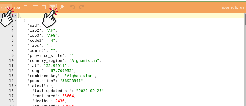
- In select fields, select the fields that we are interested in
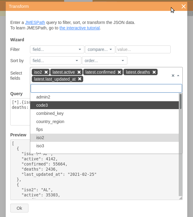
- In Sort by, select latest.active and select descending so that the countries with the most active cases show up at the top
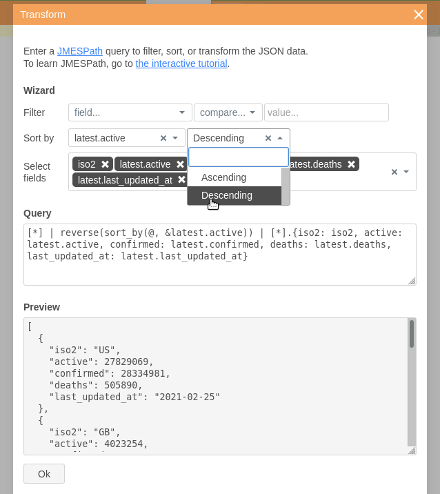
- Then copy the entire text from the Query section. You can change the JMES query to your needs.
- Am going to bring iso2 field to the front, so that its easier to create charts in Google Sheets, so the updated JMES Path query looks like this
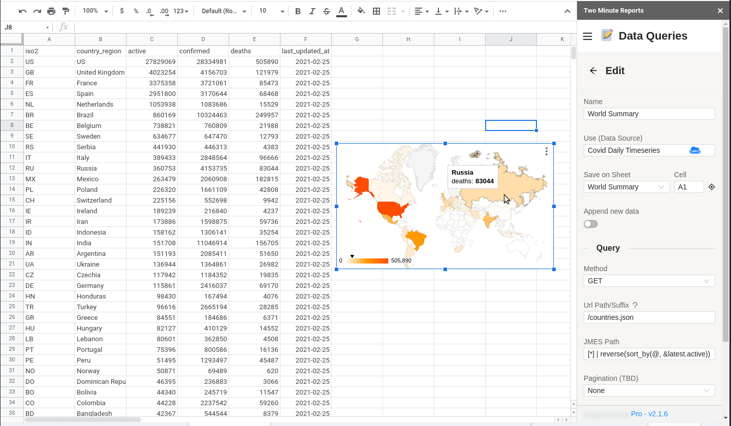
[] | reverse(sort_by(@, &latest.active)) | [].{iso2: iso2,country_region: country_region, active: latest.active, confirmed: latest.confirmed, deaths: latest.deaths, last_updated_at: latest.last_updated_at}- Paste it in the JMES Path and re run the query.
- You can easily create the Global Countries Map Chart highlighting Daily Deaths.
Make dynamic API requests with Google Sheets formulas
To create our Top 5 country-wise charts, we need to hit the /countries/ISO.json endpoint. But the challenge is that, the Top 5 countries will keep changing based on the number of new cases. So we need to first find the Top 5 countries and then automatically hit their corresponding endpoints like /countries/US.json, /countries/GB.json for United Kingdom, etc.
In the previous section, we already added iso2 column, which was sorted based on the number of active cases. So the top 5 ISO codes from this column will point to the latest Top 5 countries. Problem solved!
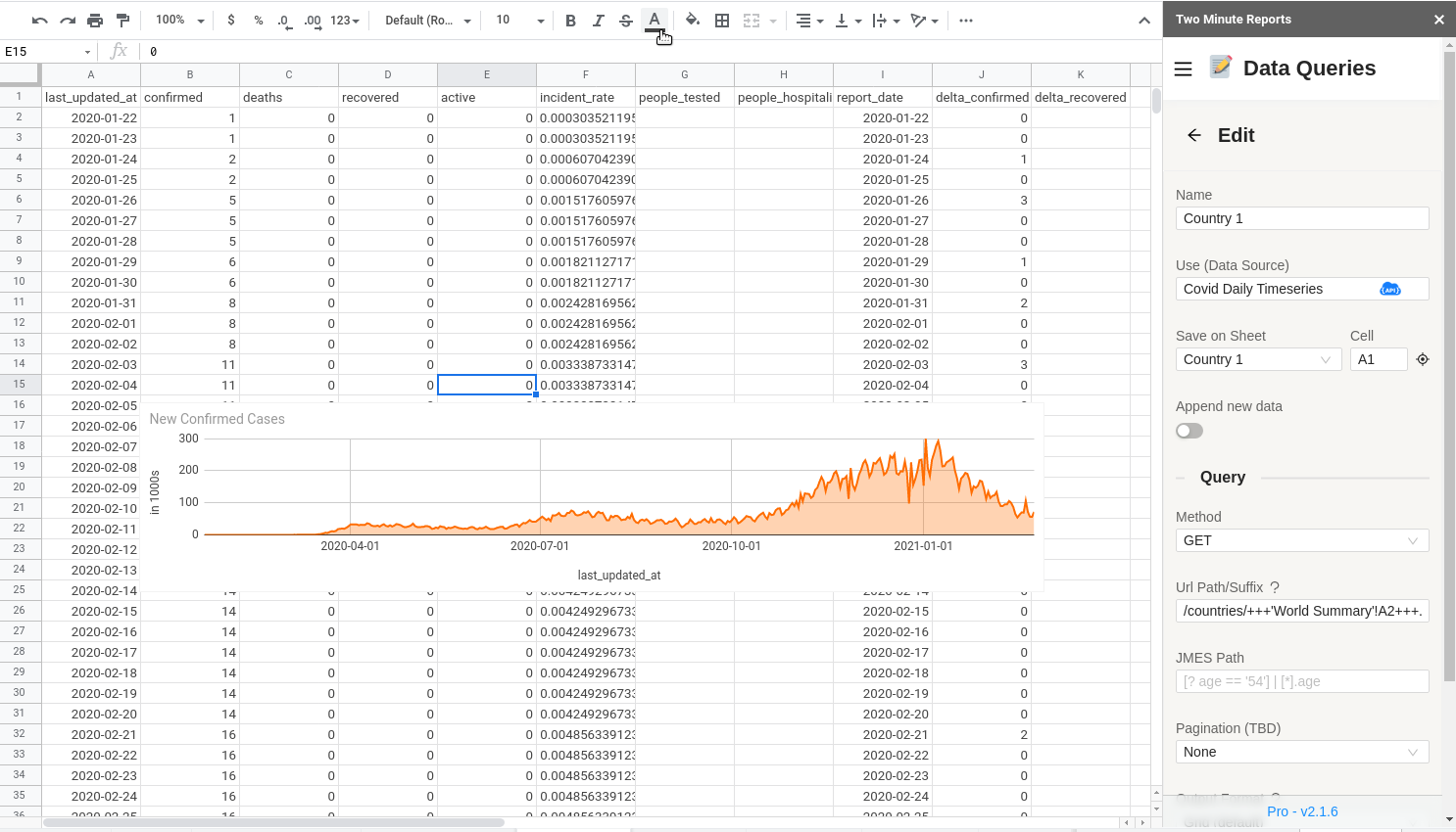
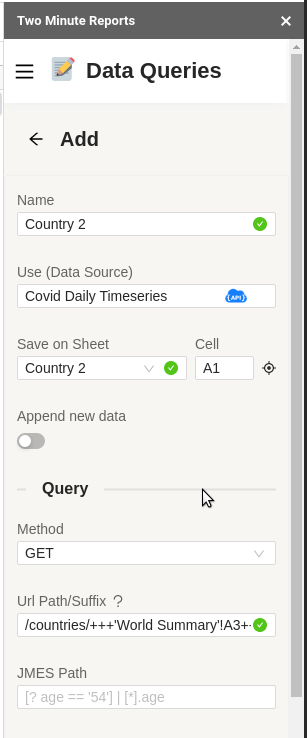
Now, to dynamic fetch the Top countries’ ISO code and hit the /countries/ISO.json endpoint, we use API Bridge’s Spreadsheet formula syntax. The formula ‘World Summary'!A2‘ will give the most active country’s ISO code, ‘World Summary'!A3‘ will give the next most active country’s ISO code, and so on.
Lets create a new Data Query, and name it Country 1. Also create a sheet called Country 1 to hold the new country data. Enter the URL suffix by carefully replacing the dynamic parts of the endpoint with a formula cell reference. Remember to add +++ before and after the formula. Our first Country 1’s URL Suffix will look like this /countries/+++'World Summary'!A2+++.json
Once saved, you can easily copy this query to create new queries for Country 2,3,4 and 5
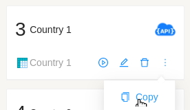
Add a new sheet, Country 2 and modify the Sheet Name to Country 2 and the Suffix URL to /countries/+++'World Summary'!A3+++.json.
Repeat this for Countries 3,4 and 5.
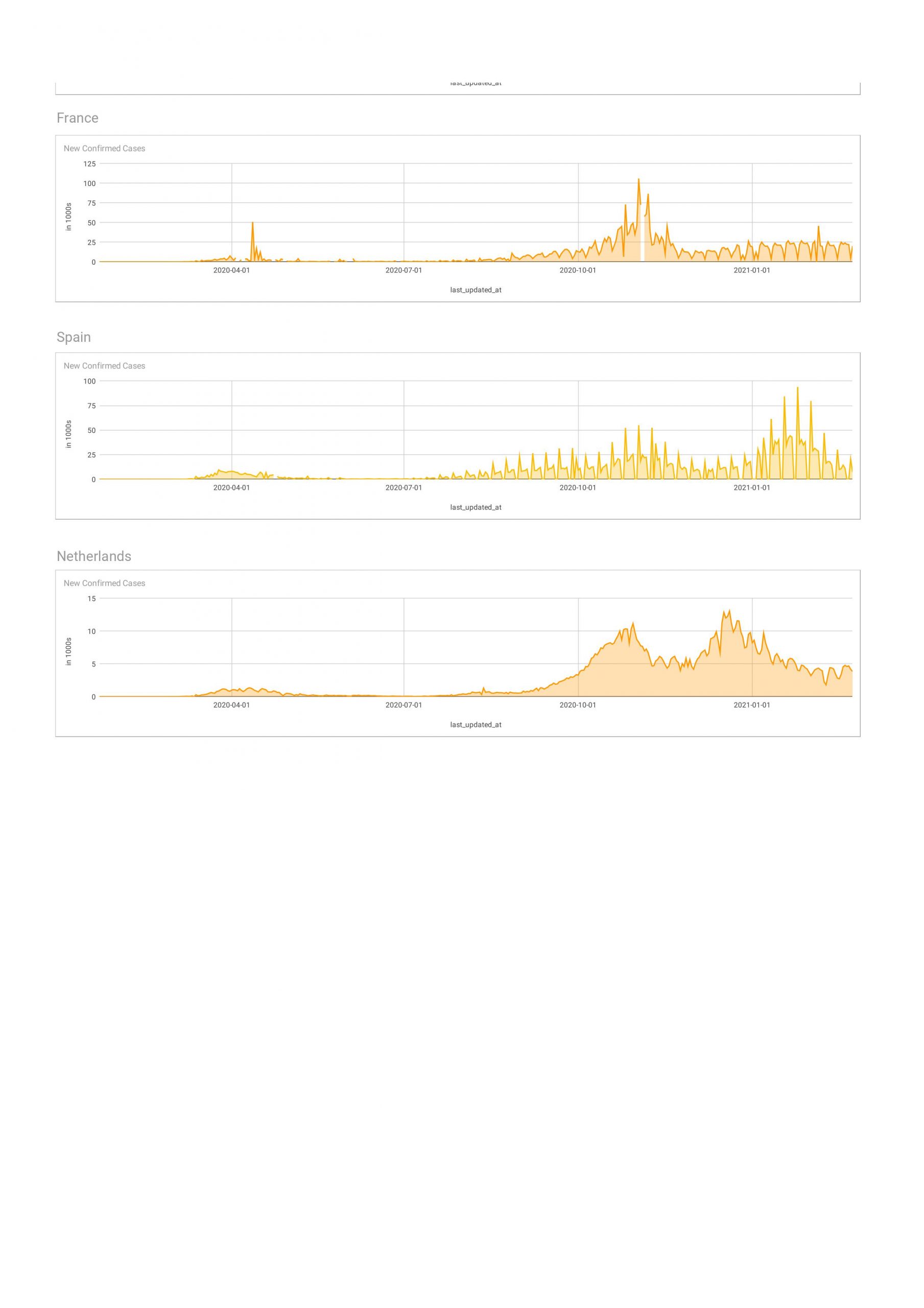
Once done , you can copy the charts from each of sheets to a new Sheet and arrange it there. Below is our newly formatted sheet. Looks nice !!, right?
Update Spreadsheet & Dashboard Automatically
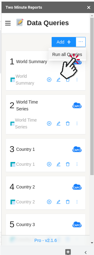
If you like, you can manually press “Run All Queries” and update the entire spreadsheet and report with the new data.
Instead of manually running this, you can also automatically execute all the queries and refresh you data even if you are not in front of the computer. To update all the data in a Spreadsheet you can create a new Schedule, which will update the data automatically for you.
Publish as a WebPage
Once you have a created a report, you can convert into a webpage like this easily.
This way users need not see all the Google Sheets stuff, your report will work like a live web based dashboard. Your reports will look more professional, and most people wont notice that this was created from a spreadsheet. You can learn more about how to do this here.