At times although a chart may look great, analyzing it can be difficult. The root cause of this problem can be the flat data used to make that particular chart. Or it can be that the data plotted is very far away from its axis. This makes it difficult for a reader to easily make out the insights from the chart and understand it. In such situations, it’ll be hugely helpful to use “Data Labels.”
What are data labels?
Data labels are used to display source data in a chart directly. They normally come from the source data, but they can include other values as well. To quickly identify a data series in a chart, you can add data labels to the data points of the chart. By default, the data labels are linked to values on the worksheet, and they update automatically when changes are made to these values.
How to add data labels to your charts?
You can add data labels to a bar, column, scatter, area, line, waterfall chart, histograms, or pie chart.
- On your computer, open the template you desire. In Google sheets.
- Double-click the chart you want to change.
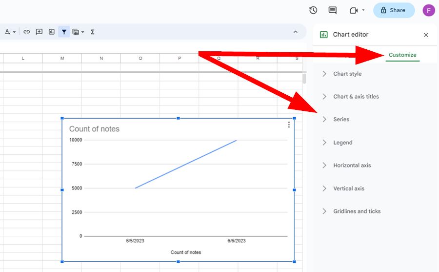
- At the right, click Customize ->Series.
- Hit the checkbox next to “Data labels.”
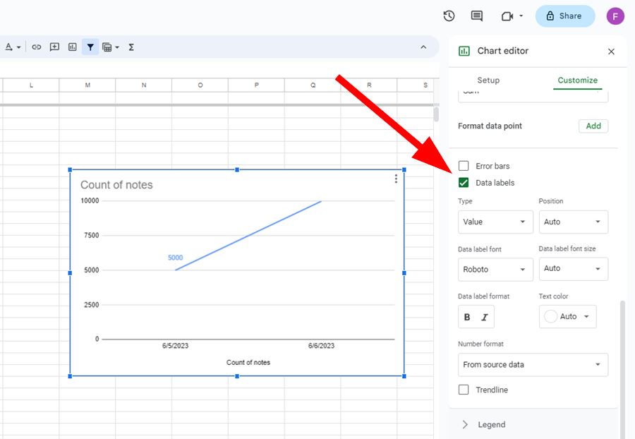

- To tailor-make your data labels, you can change the font, style, colour, and number format.
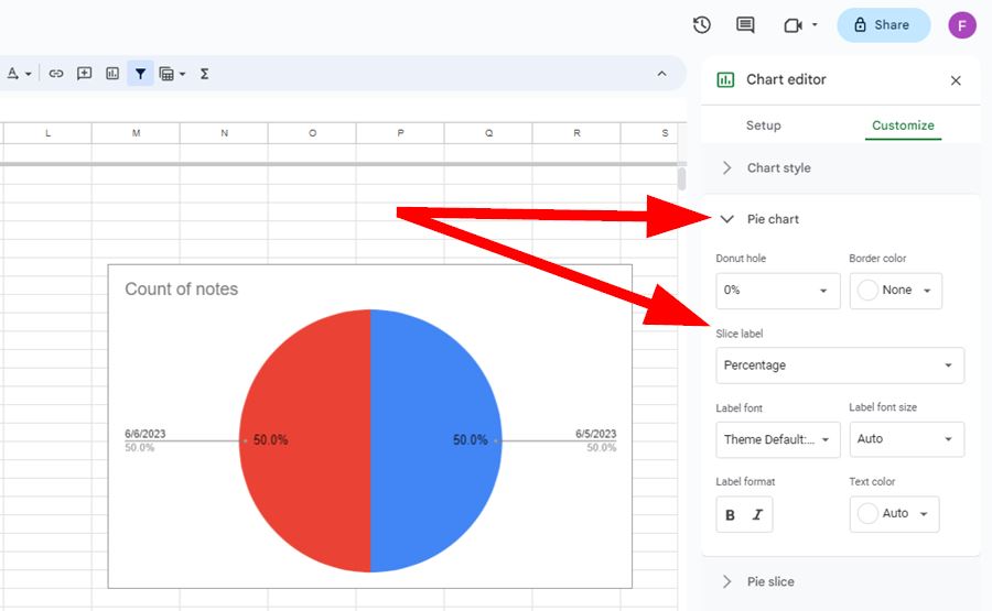
- If you’re creating a pie chart, Click Pie chart.
- Choose an option, under “Slice label”.

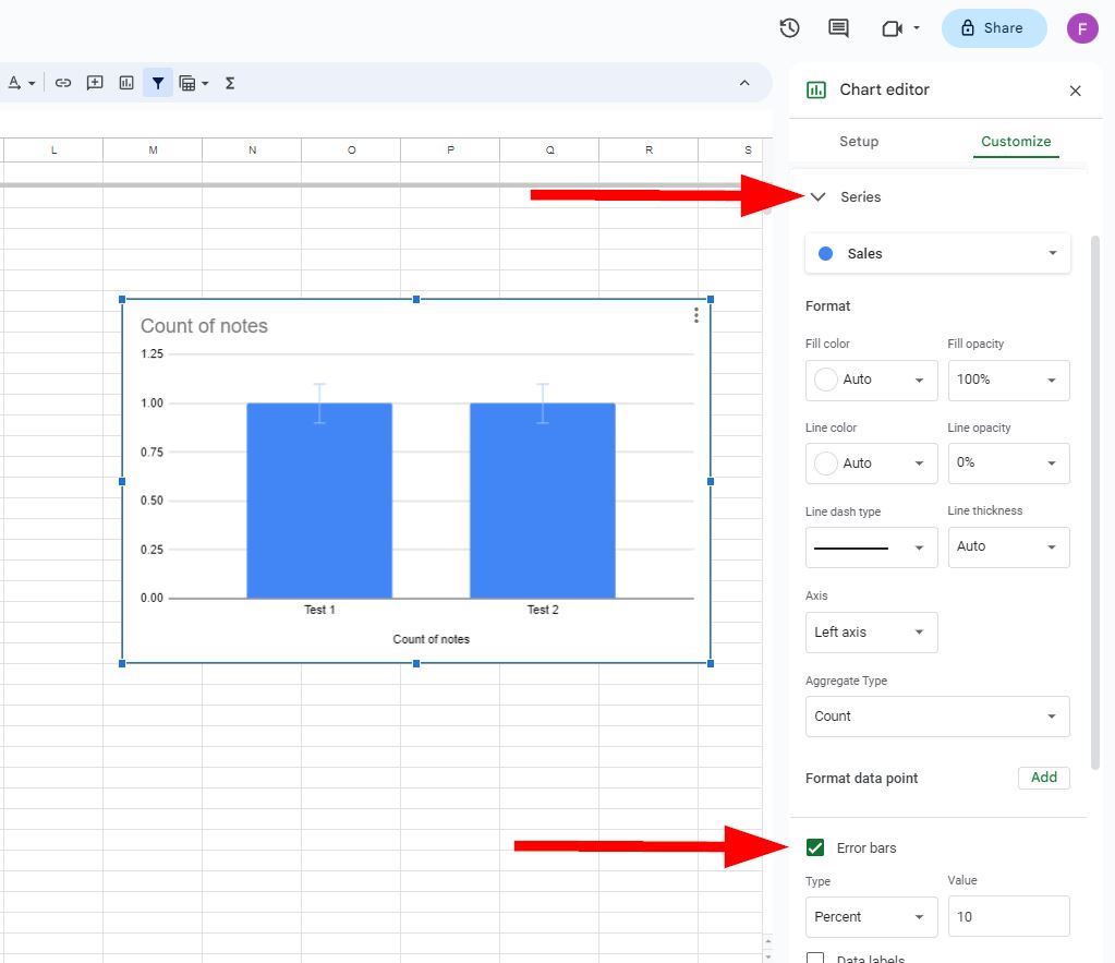
- To add error bars in a chart, Click Customize ->Series, hit the box next to the “Error Bars”, choose the type and value.
And that’s how simple it is to add data labels to your charts in Google Sheets. We hope you liked this tutorial on how to add data labels for your charts in Google Sheets. If you have any questions please feel free to comment below or contact our Support Team.